
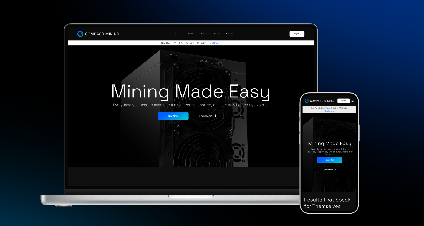

When I joined Compass Mining, the public website was the company's main sales channel for bitcoin miners and hosting, but it was built as a minimal storefront: a home page, a hardware marketplace, miner detail pages, a checkout flow, and a basic list of hosting facilities. It showed what Compass sold, but did little to help buyers understand their options, compare them, or feel confident enough to complete a significant purchase.
As the lead designer, I took on the redesign as a self-initiated project. I started with a heuristic analysis of every page, then layered in Google Analytics and Mixpanel data on entry points, exits, time on page, goal conversions , and abandoned carts to pinpoint where buyers were dropping off. Interviews with current and prospective customers showed what they looked for before committing to a purchase, and I tested new designs with those same users before launch. The goal was a site that served both sides: a clearer, more trustworthy buying experience for customers, and a stronger conversion path for the business.
Product Design Lead
0-1 Product Design
Prototyping
Research & Discovery
UX Architecture
The redesign turned the website into a sales channel that actually supported buyers through a purchase. Post-launch analytics showed fewer exits on the the checkout and facility pages, where visitors had previously dropped off most, along with a steady rise in add-to-carts and goal conversions through checkout. Customers we tested with consistently preferred the new designs, saying it was easier to compare miners and understand what they were buying, and that confidence carried into higher customer satisfaction after launch. The new structure and visual system also became the standard for the site going forward, giving Compass a foundation to grow on rather than a one-time fix.
My goal was to turn a minimal storefront into a site that guided buyers from first visit to checkout. Because the website was Compass's main sales channel, every decision had to work for two audiences: customers making a significant purchase, and a business that depended on converting them. I grounded the work in behavioral data and direct conversations with buyers, then validated designs with those same customers before launch.
I began with a heuristic analysis of every page, flagging dead ends, unclear messaging, and inconsistent patterns across the home, hardware, miner detail, checkout, and facility pages. I paired those findings with Google Analytics and Mixpanel data on entry points, exits, and cart abandonment, then interviewed current and prospective customers to understand what they needed to see before committing to a purchase.
I built interactive prototypes of the redesigned pages and purchase flow and tested them with the same customers I had interviewed. Their feedback confirmed what was working, surfaced gaps we had missed, and let me iterate quickly before anything went to development.
Rather than patching the existing site, I started over with a design system built to outlast the redesign. I created a library of reusable components with scalability in mind, so every page that followed could be built from the same foundation. Working closely with engineering, I handed off annotated designs and components that let them build faster and more consistently, giving Compass a system that supported growth.
After launch, I tracked the metrics that mattered most in Google Analytics and Mixpanel: page exits, add-to-carts, cart abandonment, and goal conversions. Comparing post-launch data against the original baseline showed where the redesign was working and guided the next round of refinements.
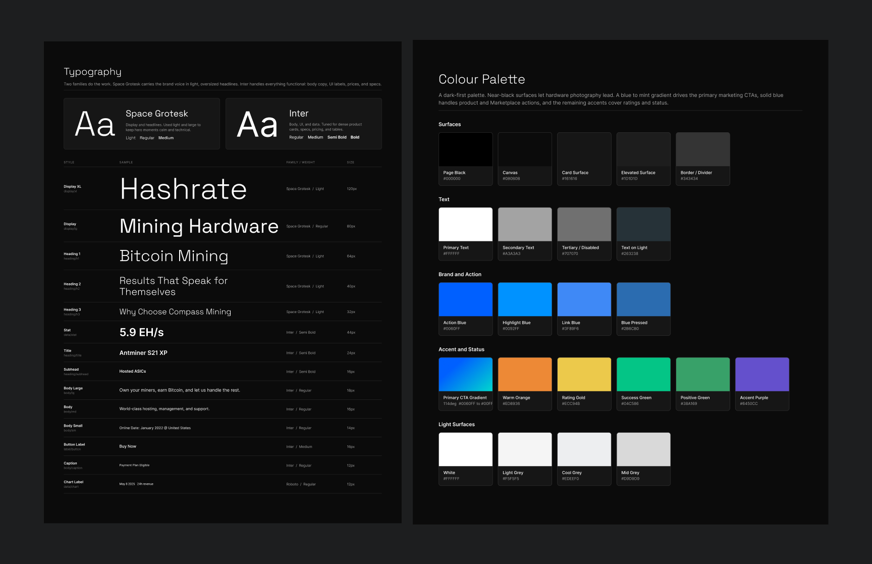
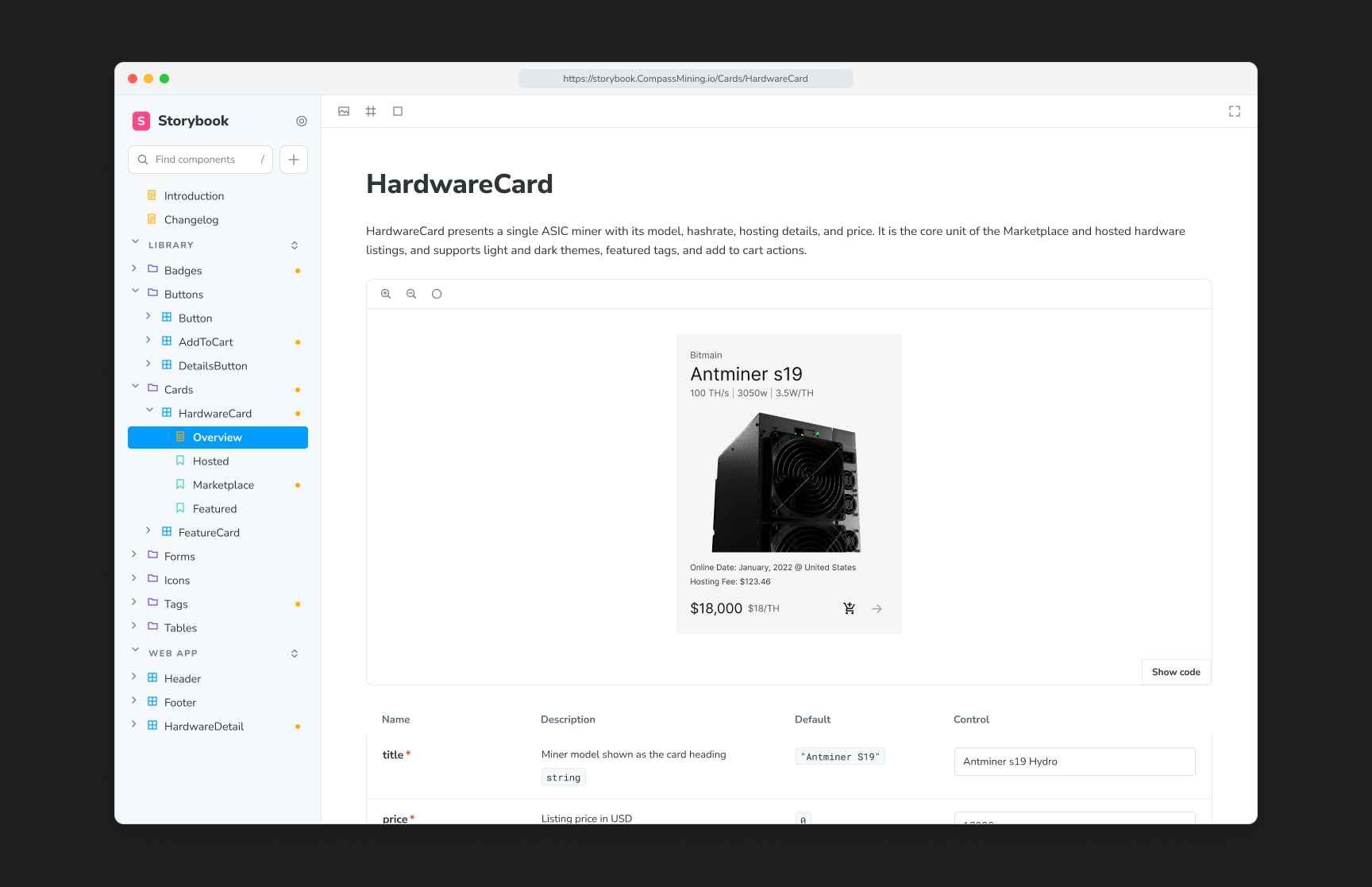
Compass had no design system when I joined, so pages were built one at a time and drifted further out of alignment with every release. I built one from the ground up, designed to scale with the business rather than just solve for the redesign. The foundation started with a dark-first palette that let the hardware photography lead. From there I defined buttons, form controls, tags, badges, icons, and navigation patterns, all with variants programmed into the figma component library so new pages and features could be quickly and consistently assembled from existing parts instead of designed from zero.
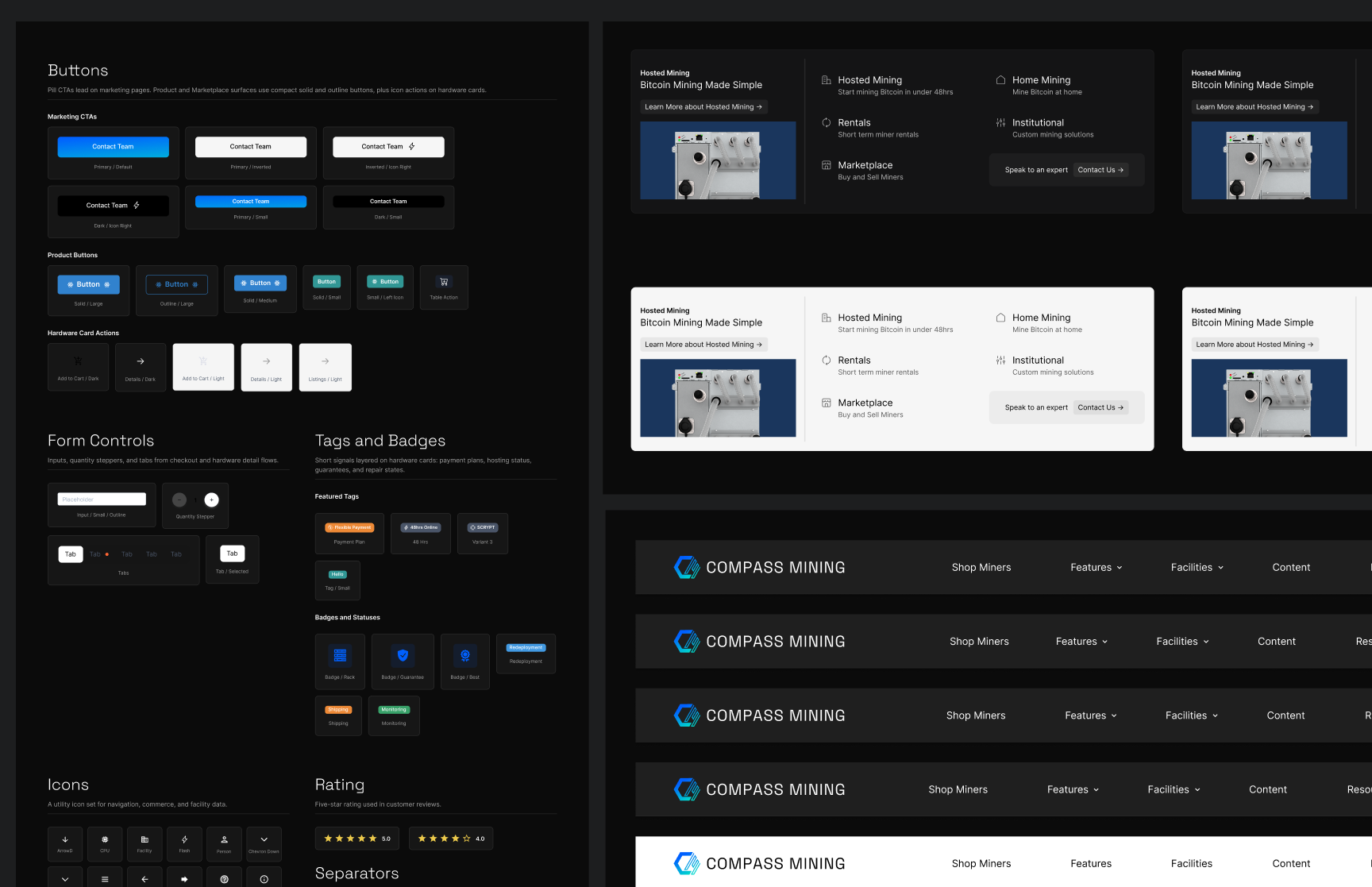
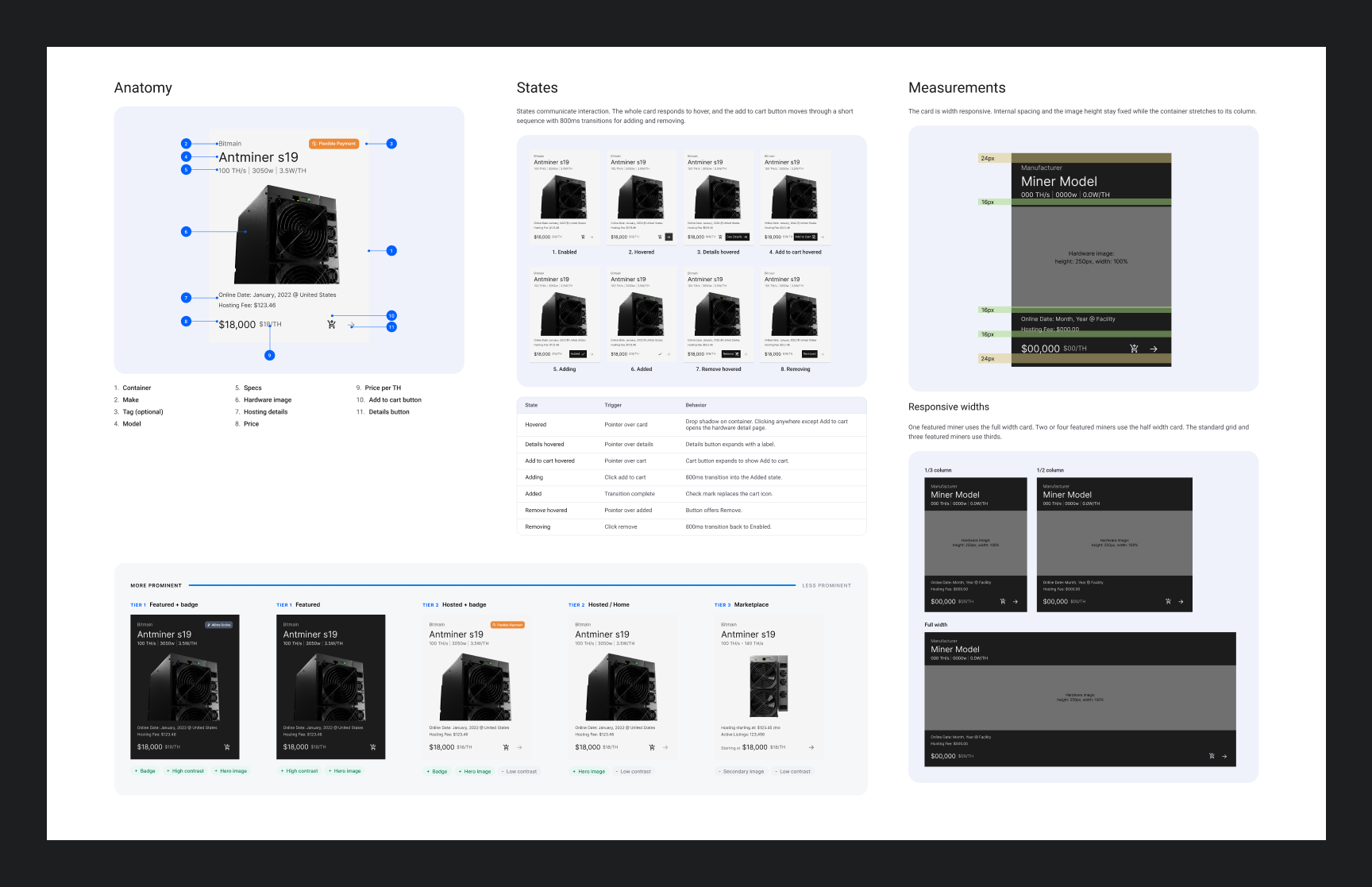
Every component was designed and documented to the level engineering needed to build it without guesswork. The Hardware Card, the core unit of the hardware page and the most trafficked page on the site, shows the approach: I documented its anatomy, every interaction state from hover through add to cart, spacing measurements, responsive behavior across column widths, and a tiered hierarchy for featured, hosted, and marketplace listings. I then partnered with engineering to bring components and patterns into Storybook, giving the team a single source of truth with live props and usage guidance. The result was consistent implementation across the site and a faster path from design to deployment, since engineers could pull from a shared library instead of rebuilding UI page by page.
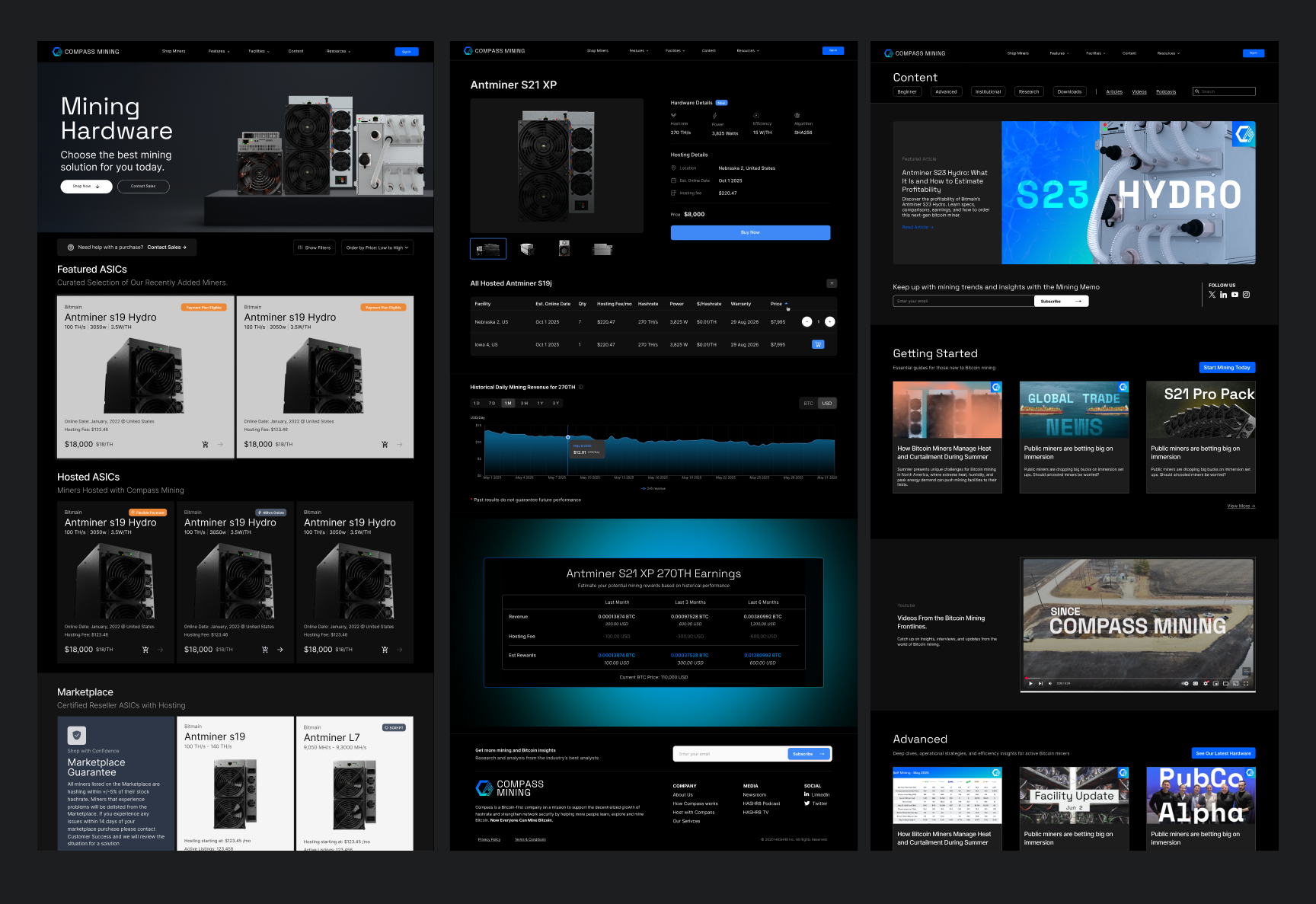
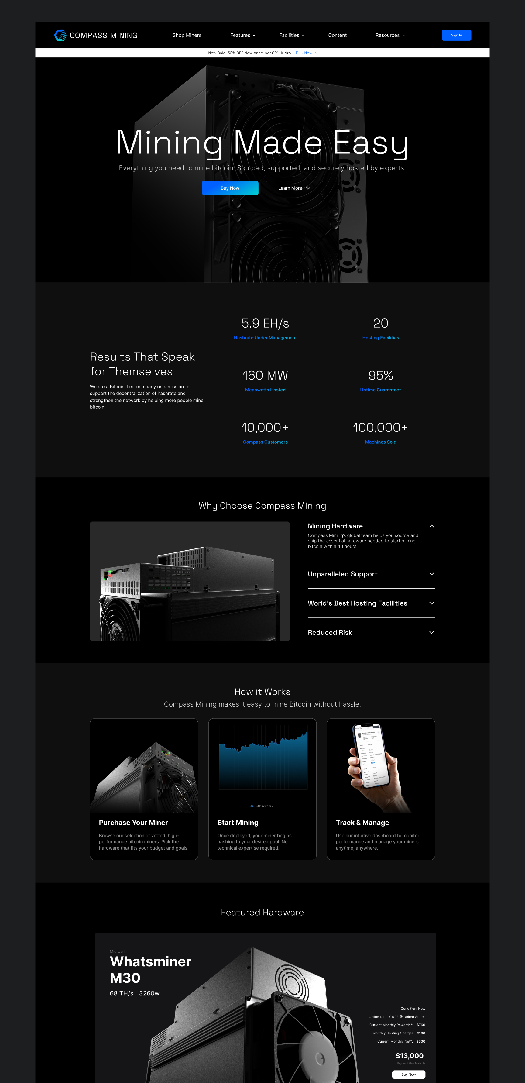
The final designs brought the research, testing, and design system together into a site built around how customers actually shop for miners. Every layout decision traces back to something we learned: analytics showed where visitors stalled or left, and customer interviews showed what they needed to see before committing to a purchase. Those insights shaped a clearer hierarchy across the home page, hardware listings, and miner detail pages, with specs, pricing, and hosting details surfaced where buyers look for them and every page leading to a deliberate next step. Built entirely from the new component library, the screens stay consistent from first visit to checkout, giving customers a more confident buying experience and giving the business a stronger path to conversion.



Key Takeaways
The biggest lesson from this project was how much the early foundational work paid off over time. Taking the time to build a design system and scalable components at the start of my tenure, rather than just fixing the most visible problems, gave the team a foundation we built on for years. As customer feedback and analytics continued to reveal new opportunities, we reworked and expanded pages regularly, and the system made those changes faster and more consistent instead of adding design debt. Nothing about the site was ever treated as finished, but because design and engineering shared the same components and patterns from day one, we could keep improving the experience without starting over.